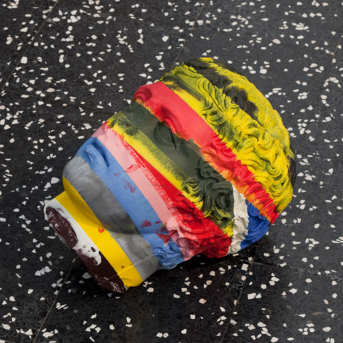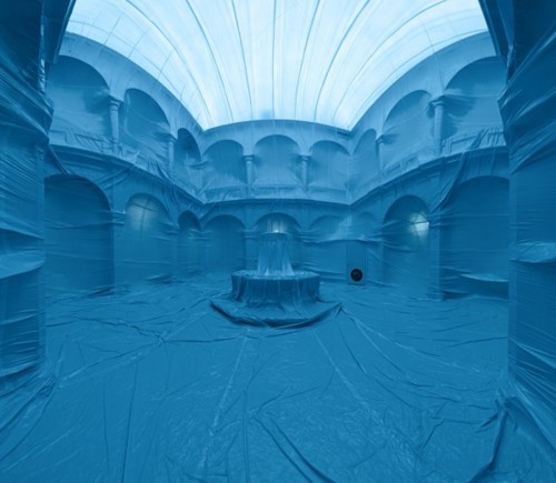
Very cool temporary installations by Penique Productions, who inspired by Christo and the likes, assemble gigantic plastic balloons which they inflate to line the inside of a chosen space. A temporary monochromatic fantasy land.
via trendland
Very cool temporary installations by Penique Productions, who inspired by Christo and the likes, assemble gigantic plastic balloons which they inflate to line the inside of a chosen space. A temporary monochromatic fantasy land.
via trendland
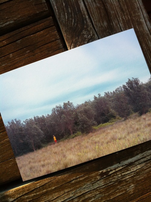
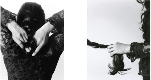
I saw David-Ashley Kerr's exhibition, Rückenfigur, on its last day at Dear Patti Smith. Kerr and I were part of the same group show, Photography 10A, at the Brunswick Street Gallery back in 2010. I had seen his work at another group show at the Colour Factory this year. Rückenfigur was his first solo show.
The first thing I noticed once I entered the gallery was large-size prints. There were 4 light jet prints of 80x140 cm and 6 chromira prints of 117x200cm, all mounted on foam core. The details in each of Kerr’s photos was amazing. The photos depicted one individual in a contemplative state and set against a vast landscape. The minuscule subject in each photo is practically immersed in the massive landscape. As a viewer, you get lost in the grandeur.
Inspired from the German Romantic painter Caspar David Friedrich, we can see how Kerr invites us to take a moment to contemplate the beauty in the world that surrounds us. Having studied German Romanticism, Friedrich’s paintings reflected the notion of the sublime found in nature, as seen through the eyes of a halted subject admiring the scenery. In Kerr’s images, the subjects don’t appear struck by the sublime beauty of nature. Instead, the subjects are part of the landscape and the subject’s minuscule size against the landscape is what makes the whole image breathtaking. Unlike Friedrich’s cold colour palette of the characteristic Germanic landscape, Kerr used the warmer tones that are typical of Australian landscapes. Overall, Kerr successfully managed to depict in a unique manner the natural beauty of Australia.
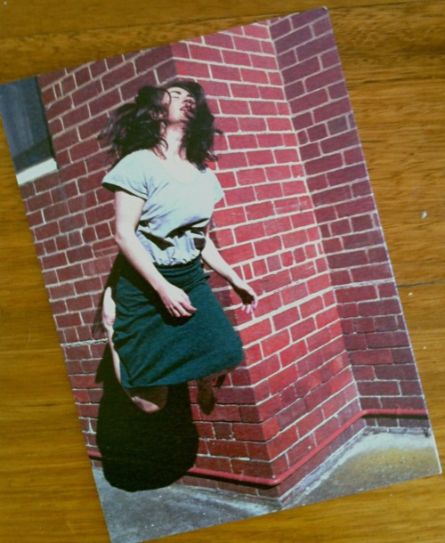
I was at Beam Contemporary Gallery on Friday to see Clare Rae's exhibition, 'Light Weight'. The series consists of self-portrait shot in broad daylight and explores the link between performance and photography. There were two large light boxes, 100 x 150 cm, which really caught my eye. You almost feel like the artist is performing in the darkened room under a spot light. I liked the minimalist installation of the light boxes in the main space and the 3 smaller prints in the alcove. The combination of performance and photography is something I'll always be drawn to and I think Rae blended the two very well.

Rebecca Horn, White Body Fan, 1973
Still from performance
A thousand bikes welded together to show how quickly China’s society changes. At least, that’s what Ai Wei Wei wants to reflect in this piece for an exhibition in Taiwan.
Lars Nissen, Untitled 2011
Kate Robertson is part of a group exhibition held at Rae & Bennett Gallery. The show, People, Dust and a Whole Lot of Spirit, consists of a collection of photographs and archives relating to ConFest, Australia’s first alternative life-style festival.
I had never heard of ConFest before this exhibition. I discovered something new about one of Australia’s subcultures. Robertson’s images are worth checking out. Her 2 photos of falling dust were an amalgamation of several dust images taken with various media. Since these images were the most open to interpretation, there was something very captivating about it.
Digital print, 42 x 59 cm
Gelatin silver prints, satin finish, 43x53 cm
I presented this body of work along with 2 video projections for my end of semester assessment. The work was one of my several attempts at reflecting on societal expectations of what it means to be a woman. It is a difficult idea to convey visually without being too literal.
I used analogue and digital photography for this project. The black and white prints were the largest I’ve ever printed in the darkroom so far. It took me half a day to get the exposure right. If I wasn’t so pressed for time due to the looming end of semester assessment I would have tried to print even bigger.
For the colour print, I shot with studio lighting and my Nikon D5000. It’s probably my favorite piece in the whole project because of the vibrant colour and whimsical look. I would like to reshoot it again, perhaps with a medium format camera or a higher end digital body to compare the final results.
Hard to believe a year has gone by! My first week back at uni feels like it was just a little while ago. So much has happened. From learning about art history to printing in a colour darkroom to editing my first movie has definitely filled the year you barely noticed it going by. I have a few artistic projects in mind for the summer holidays besides catching up with friends and going for a little trip to Hobart to check out the MONA.
I saw the current exhibition at C3 Contemporary Art Space at the Abbotsford convent. Vanessa Van Houten’s series’, Suki and the paperfold, was the one that struck me the most. It explored identity, memory, heritage, and the past. The display of the series was interesting too, as they consisted of several arrangements or clusters of images of various sizes each including an artefact, a landscape, and a staged portrait. There is an interesting visual narrative. I like the way Van Houten explored the concepts of culture and identity. The artist’s diverse cultural background has undoubtedly influenced this current exhibition.

Jacques Poirier (1928-2002) was a French painter. His paintings were done in the realist “Trompe l’Oeil” style with a mastery and a poetry rarely seen in this genre.
The German artist Oliver Laric casted sculptures in colourful wax inspired from classical Greek antiquity. The series Kopienkritik means “copy criticism” and is about the Roman sculpture as a stand-in for lost Greek works.

Yayoi Kusama | 草間彌生 - The Moment of Generation. Stitched fabric, urethane, wood, paint (2004)
Photo by Joaquin Cortés / Roman Lores
The German artist Regine Ramseier hand-picked these 2000 dandelions for her installation. After spraying them with adhesive, she carefully transported them in special trays in her car. Very impressive.
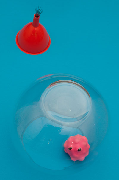
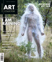
I discovered the artist Justin Shoulder who was featured on the cover of the July edition of the Australian Art Collector. The image on the front cover caught my eye, but it’s the photo of the red creature that made it for me. I love how Shoulder combines the environment to stage his colourful portraits. There is something very tactile about his costumes. I’m not surprised when he describes his practice as “a theater of the senses”. His work is a combination of performance, installation, and photography. An Australian emerging artist worth keeping an eye on!
GlutGlut by Justin Shoulder
I went to see the play ‘Hedda Gabler’ last week as part of the Melbourne Festival 2011. I had never seen an Ibsen play but a classmate invited me as her mother had performed the part of Hedda several years ago in Sydney. I was intrigued by the fact that though the original play was published back in 1890 it featured a lead female character that was seen by critics as both evil and a feminist.The play was entirely performed in German with English subtitles. I really enjoyed it, even sans interruption, so much that I didn’t notice the 2 hours flying by. The glass-walled minimalist set designed by Thomas Ostermeier was perfect for this play. The great performance of the protagonist Hedda, whose power-fuelled character was prepared to go to extremes and at all costs, made me feel both angry and sad.

Korean artist Yeong-Deok Seo creates imposing figurative sculptures using tightly knit configurations of welded bicycle chains and industrial steel chains. While impressive in their intricacy and the apparent skill required to create them, the artwork’s titles such as Infection – Anguish, Infection – Ego, and Addict, suggest the rippled surface created by the materials is not an arbitrary decision. These are figures of individuals in dispair, pockmarked with disease, the chains acting as a metaphor for the human condition. See much more of Seo’s work spanning the past several years here. (By Christopher)

Imagine walking into a silent room where a woman is mending. Now imagine that she’s sitting underneath 1,500 pairs of sharp Chinese scissors that are suspended from the ceiling, precariously pointed downwards. This was the idea behind The Mending Project by Beili Liu.
http://www.beililiu.com/index.html
My 1-minute video assignment using Final Cut Pro.
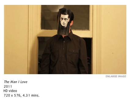
There was an opening at Dianne Tanzer Gallery yesterday. One of the featured artists is Iolanthe Iezzi whose video, The man I love, is worth checking out. Iezzi works in Melbourne in film, photography, design, installation, and short story writing. I’d be interested in seeing the rest of her work. Her video explored a woman’s loneliness and memories with humour. Simple, yet poignant.
Also worth checking out is the stencil art of the Aboriginal artist Reko Rennie and the minimalist black and white painting series, Ring Cycle, of Magda Cebokli.
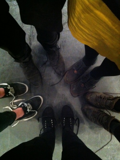
On October 5th, I participated in my first public performance at ACCA for its opening exhibition “Power to the People: Contemporary Conceptualism & Object in Art”. I was one of the 20 people, most of which were VCA students, who performed in Roman Ondak’s work, Resistance. The performance lasted 30 minutes in Gallery 1, where we stood in small groups, socialising with our shoes untied. At the end of the performance, we all collectively tied our laces up.
During the performance, we observed for visitors reactions. One woman walked by, stared at our feet, and smiled. I saw her in the lobby after the performance and asked her what she thought of it. She said she felt so proud of herself for having noticed it.
I liked the idea of having been involved in a performance that what kept secret from the public. Ondak’s work “consists of subtle interventions into sociocultural structures, which denote processes in society that are often outside of direct public visibility” (Kontakt gallery). Resistance was about questioning social behaviours and our perception of them. I wonder how many people noticed.